CLISEL
A Coordination and support action of Horizon 2020 about Law and Climate-induced migration
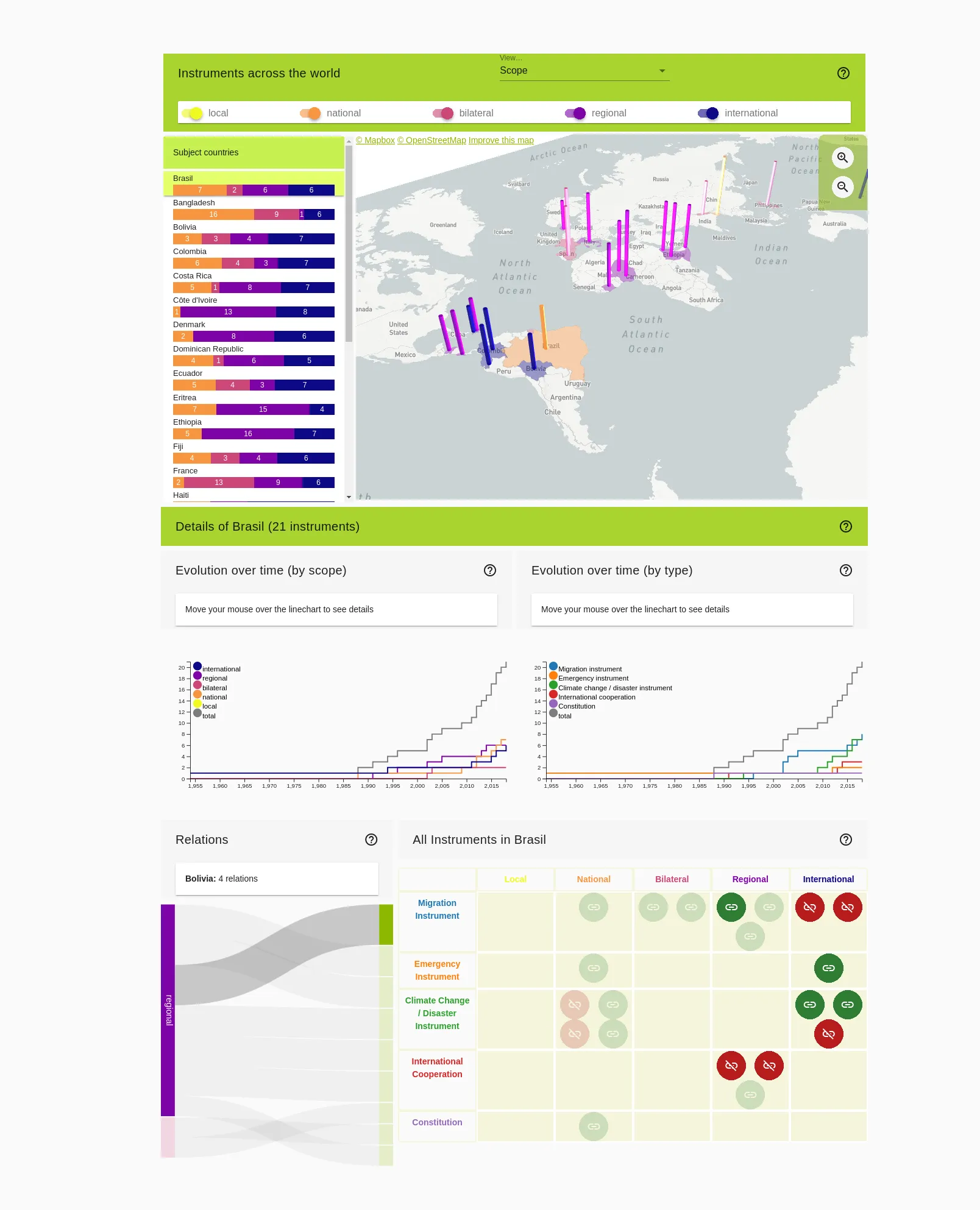
The CLISEL Project was a Coordination and support action of Horizon 2020. Its aim was to study the relationships between law instruments or historical policies, and climate-induced migration. The project involved various partners across Europe: the University of Caligari, the World Trade Institute of the University of Bern, the University of Lancaster, the KTH Royal Institute of Technology and the Centre for Local Authorities of Sardinia. Among the deliverables of the project, CLISEL was to provide a map of law instruments used across the subject countries of the study (the Interactive Maps), another map that displays historical cases of climate-induced migration (the Geo Archive) and a mobile application for local authorities (the Travel App).
I was initially hired as a data visualization designer with the aim to develop visualizations for the Interactive Maps and the Geo Archive. It soon turned out that I also had to entirely develop both deliverables, as well as the complete backend and REST Apis. Considering the strong economical and time constraints, I settled for high-level, (then) prototypal technologies for the task:
- D3, Deck.gl, Openlayers for visualizations
- Vue, Nuxt, Vuetify for the frontend
- Express, Sequelize and Passport for the backend
- Taiga for organization
Design-wise, we suffered from severe setbacks during the development of the visualizations, because we could not obtain datasets that were fundamental to our initial decisions (we aimed for Origin-Destination visualizations). At the end of the day, we choose a set of well-known visualizations that would look decent from an aesthetical perspective, but that would also foster interesting insights for analysts. We even crossed the infamous line of 3d visualizations by using a 3d Map for the Interactive Maps: this is meant as a "bait" to attract attention, so that the analysts would keep digging what they see.
Lessons learned:
- Overall, I was happy with the technological stack that we relied on. My colleague in charge of the Travel App, Ben "bnzk" Stähli, seemed to like it as well.
- It was perfect for the task at hand, but I think the ever-evolving technologies could have exhausted our little team on the long run.
- The combination of Passport.js and Sequelize.js works well if you are willing to invest the time.
- Scopes, in Sequelize, are a very pleasant feature that I dearly missed.
- Passport.js sounds like the right authentication middleware for pretty much all your NodeJS needs.
- Server management with MeteorJS is challenging. Once deployed, a MeteorJS app is nothing but a NodeJS app requiring a specific version and a few dependencies. Still, the doc isn't very clear about it, and MUP does not play easy with other servers.
- I was glad to manipulate WebGL through Deck.gl, however that library is (or was, in March 2019) far from mature. Initially thought as a React library, most of its documentations still bears that lineage. Morever, the APIs were not always consistent, sometimes bearning diverging names for similar methods in different layers.
- Openlayers was somewhat more mature and convenient to use for the Geo Archive.
- Data visualization is hard to discuss. Most people assume that it is about producing compelling visuals, but this is a graphic designer's job, not a visualization designer's. The latter mainly focuses on exploratory visualizations, that allow analysts to discover new knowledge out of their data, rather than exposing preexisting insights. Explaining this different was, is, and is likely to remain a major stubbling rock when collaborating with people in other fields.