UX researchers salaries
A more advanced attempt at building exploratory visualizations with Vega and Vega-lite
A fellow employee of Liip shared the results of UXR Salary Survey 2023 by Learners, a public survey on UX Researchers, where they were asked details about themselves and their compensations. Along with the sharing came a suggestion: try to get as much as possible out of this dataset. Obviously, I was more than happy to take this opportunity to improve my skills with Vega. I first cleaned up and adapted the data, mostly by making currencies more consistent and by converting compensations into USD.
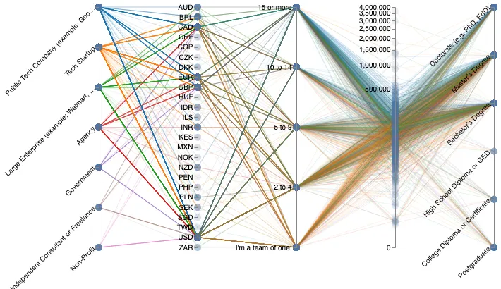
My initial thought was to try a Parallel Coordinates, as any dataset with a fair amount of dimensions can always benefit from it. There are, however, two caveats with Parallel Coordinates that prevent them from working well in some situations: (1) they're not fitted for ordinal data unless you use some tricks (parallel bubbles, parallel sets, etc), (2) they're pretty limited if you cannot reorder the columns. Both issues were relevant in our case. The dataset comprises a single quantitative dimension, two ordinal dimensions and a handful of categorical dimensions. On top of this, I've been vainly struggling with both Vega and Vega-lite to allow the reordering of the columns. The example of Parallel Coordinates in Vega-lite is somewhat of an experiment. It is more about proving that you can somehow do this, than actually providing an efficient way of doing it. Vega's example seems easier to understand. In any case, I felt that building the visualization was simpler with D3, back when I worked on the premDAT experiment.
1: The parallel coordinates. Try to hover the dots along the axes.
At the end of the day, I built a simple Parallel Coordinates with "impact bubbles" to show what values of the ordinal and categorical dimensions were the most common. By hovering a bubble with your cursor, lines that do not cross that bubble will vanish, making the graph considerably more readable. Also, the "salary" column was almost impossible to read with a linear scale, and I thus went for a "pow" scale with exponent 0.2. The specs are 300-lines long, with a lot of repetitions since it was made using Vega, rather than Vega-lite.
The Parallel Coordinates is merely enough to start asking ourselves questions. You can barely see that there exist some big gaps in compensations, that those who work in Public Tech Companies and Large Companies seem to earn slightly more than others, that poor countries have lower wages (especially Kenya), and that the large majority of UX researchers have a fairly high level of education. There might be other insights to take from this, but let's be honest: this is pretty underwhelming. You don't spend minutes, or even hours of your time to get rough, general ideas about a dataset. Yet here we are, squinting at a bunch of disconnected lines, trying to figure out simple things that could be more sallient with better-chosen encoding. This first attempt led me to think that a trellis visualization, displaying the distribution of the participants somehow, would be more interesting. Now, the big question: should we go for a density graph with aggregated data, like the good old Boxplots, or should we try to represent as many details as possible with a bubbleplot?
Why not both?
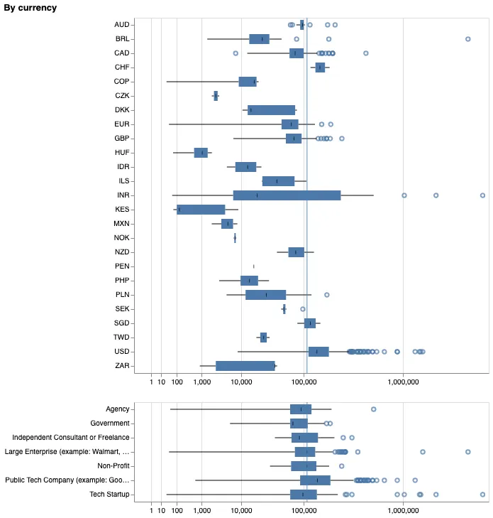
Let's start with the boxplot, since it's dead-easy to build using Vega-lite (yes, probably even easier than building simple graphs with Microsoft Excel of Google Sheets). I decided to go for two dimensions: "currencies" (and, by extension, countries) and "company types". The overall median is visible in the background, so you can quickly see which types of companies or which countries provide higher compensations, and which suffer from lower wages. I also decided to keep abnormal values visible as circles, in order to let users know where abnormally wealthy (or poor) participants would be. This simple visualization provides a lot more information, a lot faster as well, as we see directly a few things:
- Where you live is definitely a bigger determiner than the type of company where you work. No big surprise. Just a strong visual confirmation.
- I wonder if some data are corrupted, because being paid so low in Hungary and Denmark seems unlikely. Perhaps it's a part-time salary, or perhaps the participants gave their compensation in USD, despite being actually paid in their local currency.
- Tech startups and Public Tech Companies seem to offer the biggest compensations out there, roughly 150% more than agencies overall. Damn.
- If you're looking for decent wages, you shouldn't work for the government, apparently.
- India has the doubtful honor of bearing the wealthiest participant, with almost 4'000'000 USD of compensation per year. Meanwhile, the lower quartile of the country is among the lowest of the survey, and its median salary is much lower than the overall median.
- The United States host an astoundingly large number of "abnormally high salaries", although the median is slightly above the overall median.
- The Euro zone is pretty average, with a median even lower than the overall median. In this regard, the United Kingdom fares a bit better, albeit the number of "abnormal values" is higher. It's all about work performances, I guess.
2: The boxplot
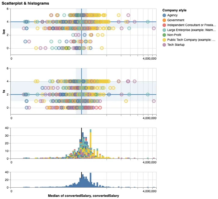
On to the bubbleplot. On top of showing the actual number of participants, this visualization is useful to explore the discrete values of your datasets, by using allowing zoom, pan and filter. To help with this, I added two histograms. The last one is a "map" where you can filter data by brushing over it. Give it a try! With such a wide range of salaries, and with so many dots to place around the median, the greatest threat here is called hallucinators. These are visual byproducts of your encoding process that give false impressions about the data. For instance: when several points overlap, the last drawn point will stand out more than those buried behind it. Try to change the "Color" value to "Currency", and you will see a huge amount of people paid in USD, so much that you might think they make up for 80% of the respondants. In reality, they represent barely more than half of the participants, but the fact that their dots are drawn almost at the end of the process make them stand out more (I surmise that Vega processes the dimensions alphabetically). To mitigate this risk, I vainly tried two things:
- Play with the opacity, as with the Parallel Coordinates. This works up to a certain level, but it proves either inefficient for really big stacks of dots (if the opacity is high enough), or destructive with singled out circles who seem to vanish from the graph (if the opacity is low enough).
- Add some jitter to the dots. This wasn't possible because of the "quantitative" nature of the dimensions.
In order to compute a median and quartile for the team sizes and the levels of education, I had to turn the ordinal dimensions into quantitative ones - thus "ts" stands for "Team size" (0 - alone, 1 - 2 to 4, etc) and "loe" stands for "Level of education" (same idea - 0 for postgraduates, 1 for high school, etc). So we're actually not just seeint a bubbleplot, but a scatterplot... with pretty limited dimensions on the y-axis. Most statisticians would probably kill me for doing this - you don't treat ordinal values as if you could do some simple math with them - but I thought it was still worthwhile to know where most participants lie regarding these two dimensions. I had a lot of issues binning the histogram, apparently because of a bug when using special scales along with bins. Don't be surprised if some bars overlap - you'll have to zoom in a lot to avoid this. Now, the brushing interaction blew my mind: it was actually quite trivial to bind these scales together. Here, Vega-lite totally hits the spot and I'll probably enable this in many, many visualizations to come.
3: The trellis bubbleplot and its histograms. Try brushing over the last histogram to zoom on the other views.
Here are a few insights that I take from this viz.
- As an UX researcher, your level of education apparently does not impact your wage a lot.
- We definitely lack data on other factors to confirm this observation (work expertise could explain this, for instance).
- It seems that the sweatest spot is a Master, which also turns out to be the median level of education.
- There are 38 US participants to the survey who earn around 200'000 USD a year, which makes them the largest group of similar salaries in the dataset.
- While they're totally following the trend of the level of education, the average size of their teams seems slightly bigger than most.
- Unsurprisingly, 20 of them work for Public Tech Companies - these usually have the means to field quite a lot of researchers.
- A small majority of the respondants belongs to under-represented groups.
- It might sound surprising, but considering the number of possibly under-represented characteristics in our societies, it does make sense.
- Belonging to such groups doesn't seem to affect your wage, although we would need some proper statistical measures to confirm this.
- The "38 participants bar" mentioned above is one of the few where under-represented people are an actual minority.
- With a median of 2 out of [0,4], Q1 at 1 and Q3 at 4, the team sizes factor seem pretty balanced with most respondants.
- There is apparently a very feint trend toward slightly higher salaries when working in larger group, but we should really mind the hallucinators here before endorsing this observation fully.
- Using a sequential color scheme for this dimension would have helped making sense out of the histogram.